

Kirkland Cafe Mobile App
This individual project is a case study I created for the Google UX Design Certificate in January of 2022.


Project Introduction
Refining the design
Project Table of Contents
Understanding the user
High-Fidelity Testing
Starting the design
Accessibility
Wireframe testing
Reflection
Project Introduction

Above is visual that I created to describe the design process that I went through during this project. I took an iterative approach with two rounds of moderated usability testing
The Problem
The Kirkland Cafe needs to improve the food ordering and payment process for their cafe. They offered a photo menu viewed via QR code that is small and difficult to read. Payment made after waiting in line at the register is not efficient and provides more opportunity for employee and customer exposure to COVID-19.
The Goal
The Kirkland Cafe menu and payment app will let users filter menu items by allergens which will affect users with food allergies and dietary preferences by allowing them to select menu items that they can eat. The app will also be easy to use and allow users to place orders quickly.
I started the design process by conducting 5 interviews with potential users. Next, I completed a competitive audit by comparing 5 local cafes. Afterwards I created empathy maps, an affinity diagram and identified user pain points.
“One of the most frustrating things I experience when placing an order at a restaurant is trying to find something on the menu that is gluten free. Sometimes it doesn’t say, and I have to speak with the server about it, who doesn’t always know. I’m just trying to avoid getting sick but I also want to enjoy my meal.”
Pain Points
Online restaurant menus are often difficult to navigate and read
Paying in-person at the register can expose employees and customers to covid-19 and lines are frustrating
Ordering in-person or over the phone reduces order accuracy and can result in human error, language barriers, and communication issues
Ordering over the phone or in-person means less customer control
It is difficult to find items on the menu that fit dietary preferences and food intolerances
It is difficult to find items on the menu that fit dietary preferences and food intolerances
Meet the Users
About Alex Pine
Alex Pine is a busy, hungry college student who needs to order food from a restaurant with clear allergen information because she is allergic to gluten which could cause her physical harm.
About Carl Smith
Understanding the User
Carl Smith is a hard working constractor who needs to order and pick-up lunch quickly so that he can get back to work.


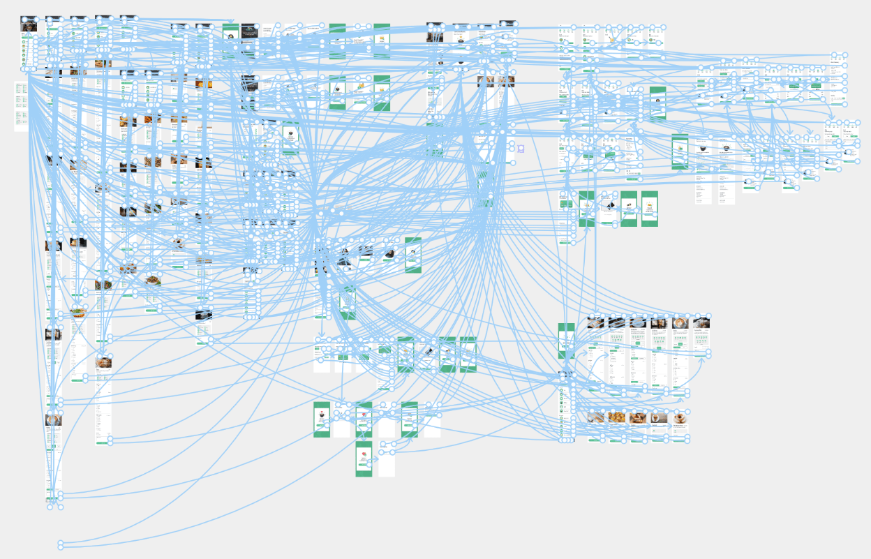
Information Architecture

Paper Wireframes

Purchase Happy Path User Flow

Digital Wireframes and Low-Fidelity Prototype

Starting the design


Want to see the low-fidelity prototype in action?

What can we learn from the steps that users take to order an item from a gluten free menu?
what can we learn from the steps that users take to order an item off the menu?
Are there any parts in the flow where users get stuck?
Do users think that the app is easy to use?
Are there more features that users would like to see included in the app?
Research Questions
Wireframe Testing
Participants order food out at least 1x per week
Participants use online ordering systems for at least half the orders they place
Participants are located in the Kirkland, WA area
1 participant had a food intolerance
Participants vary in mobile app comfort level
Participants are even in gender
Participant Requirements
20-30 minutes in duration
Conducted remotely on Zoom
Moderated usability study
Participants were asked to order a menu item and were then asked to order a gluten free menu item. Next, they were asked to add a new payment method, update their phone number, and order a free coffee that they earned through the cafe's reward system.
Methodology


Usability Study Findings
The menu filter was not used
6 out of 6 participants did not use the menu filter button to filter menu items by food intolerance when asked to order a gluten free menu item
5 out of 6 participants suggested a different name for their filter
“I didn’t really notice the menu filter or what clicking on it would do. I can see how the menu filter would be helpful if I had used it.”
Previous orders and favorites were hard to find
4 out of 6 participants found that previous orders and favorites were hard to find
3 out of 6 participants suggested moving previous orders and favorites to a top-level location.
“I feel like previous orders could be easier to find. Right now it seems buried in the 'my account' section.”
The order now button is functionless
2 out of 6 participants attempted to use the order now button
2 out of 6 participants said that the button didn't seem to do anything
“It looks like the order now button just made the app scroll down a little. I don’t get why it is there. I mean, the menu is right underneath it. It probably doesn’t need to be there at all.””


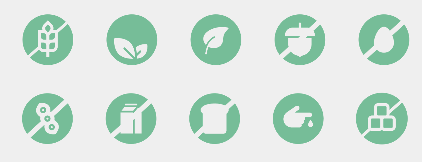
The dietary preference icons are not readable
6 out of 6 participants did not use the dietary preference icons because they are too small, pixelated, and hard to read
“The dietary preference icons are very small. I can't even see them with my glasses on.”
Rewards was confusing
3 out of 6 participants said that in progress and available rewards should be combined into 1 screen, or section.
1 out of 6 participants suggested that rewards be integrated into the payment process
“I wish that I could apply my rewards at checkout. I don’t think I would remember to use the rewards if I had to go to the rewards screen.”
The user shouldn’t have to log-in to view the menu
2 out of 6 participants mentioned that they don't normally have to log in to view a menu
“In my experience you create an account after you have selected your food and are placing your first order.”
Usability Testing Recommendations
The menu filter button should be larger, moved underneath "select a category," and should be changed to "filter menu by allergen."
Participants found that the allergen icons were to small and pixelated. Enlarge the icons.
The previous orders feature needs to be relocated to a top-level location like the bottom navigation bar.
In progress rewards and available rewards should be combined into one page. Rewards should appear during the checkout process so that users can easily apply them to their order.
Remove the order now button because it currently does not offer any functionality.
The log-in screen should be removed. Logging in should be optional and there should be a log-in button included in the top navigation bar.
The checkmarks and radial buttons should be enlarged and grouped with the text. When users select the text next to the option it should select that option.
The flow of the edit contact info and edit payment methods flow needs to be adjusted depending on where the user is accessing those pages.
Users need to be able to remove items from their cart and adjust the quantity of those items.
Users need an allergen comment box on the submit allergen page in case they have an allergy, or dietary preference that is not on the list.
Breakfast and lunch times need to be added so that users know when they can order certain items.
Reorder order and reorder items should be combined into one process.
Revisions Based on Usability Testing
The menu filter was renamed, restyled, and moved to a more obvious location

Order history and Favorites where moved to a higher level location

The allergen icons where moved and made larger.

The order now button was removed

The user can now view the menu before logging in and placing an order

Offers were removed and rewards were combined

Want to see the revised low-fidelity prototype in action?
Refining the Design
I created the following in Adobe Illustrator


High-Fidelity Mock-ups and Prototype


Want to see the first draft of the high-fidelity prototype in action?

Do the changes made to the prototype improve the user experience?
What can we learn from the steps that users take to order an item from a gluten free menu?
what can we learn from the steps that users take to order an item off the menu?
Are there any parts in the flow where users get stuck?
Do users think that the app is easy to use?
Research Questions
High-Fidelity Testing
Participants order food out at least 1x per week
Participants use online ordering systems for at least half the orders they place
Participants are located in the Kirkland, WA area
1 participant had a food intolerance
Participants vary in mobile app comfort level
Participants are even in gender
Participant Requirements
20-30 minutes in duration
Conducted remotely on Zoom
Moderated usability study
Participants were asked to order a menu item and were then asked to order a gluten free menu item. Next, they were asked to add a new payment method, update their phone number, and order a free coffee that they earned through the cafe's reward system.
Methodology
Revisions Based on Testing

I revised the filter to function with chips so that the user could easily add and remove filters

I added in tip functionality
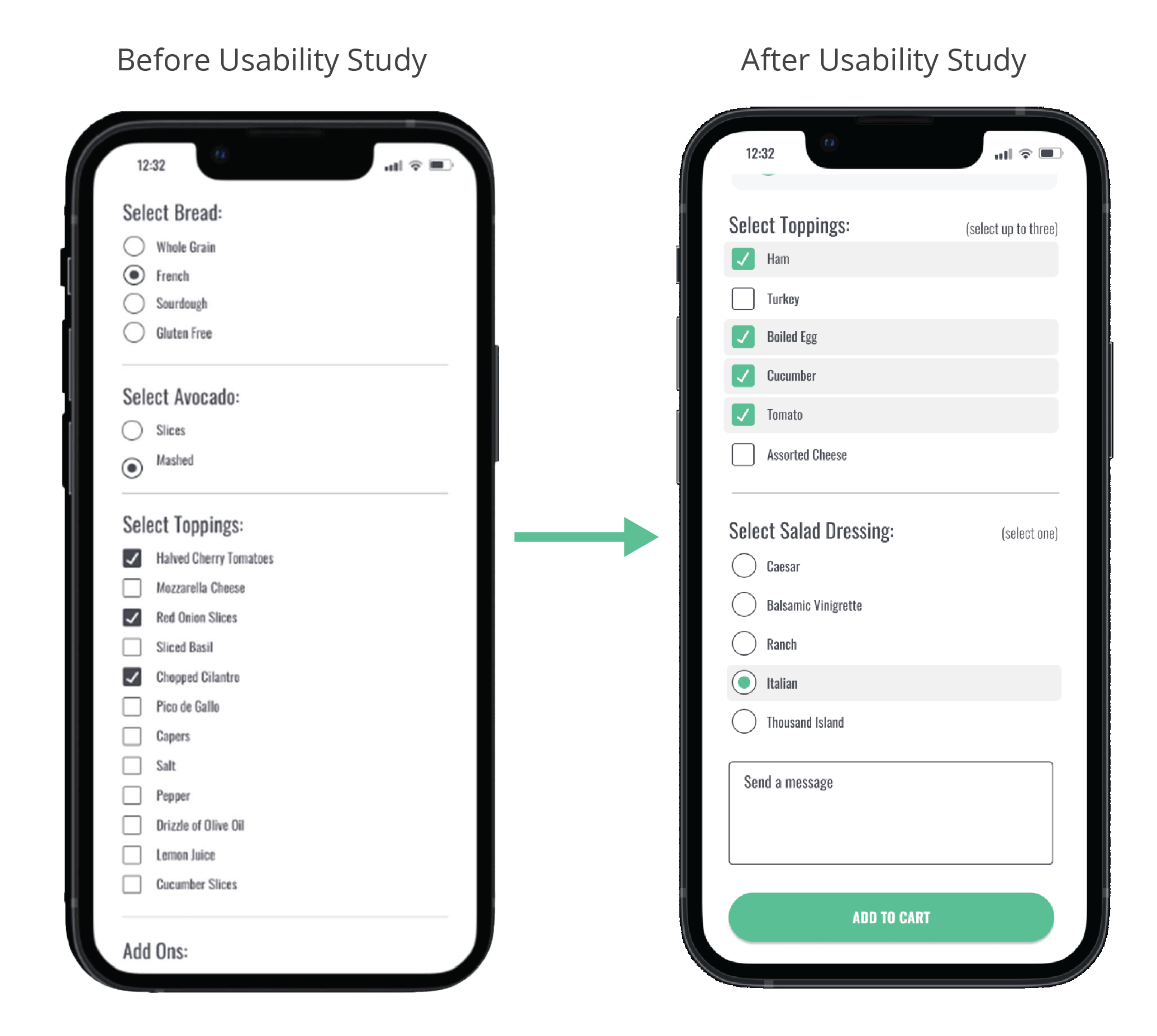
I revised the checkbox and radio button selectable area to be the entire row
Want to see the final high-fidelity prototype?
Accessibility Considerations
After completing a my second round of usability testing I paused to consider accessibility and ensured the following:
I ensured a large selection area on buttons
I removed any type that was in all caps and used title case
I ensured that text fields have eyebrow labels and follow accessible UX patterns
All colors meet WCAG color contrast guidelines
I used consistent headings, visual hierarchy, and descriptive text for content
Going Forward
Next Steps
I would recommend a third round of usability testing on the updates completed
I would also recommend revisiting the log-in flow and comparing it to other UX patterns based on testing feedback
I would prepare files in Figma for a seamless hand-off to the development team.
Project Impact
"The menu filter would save me a lot of time and frustration. I love it! I hate going into a restaurant and not being able to find something that is gluten free. As someone who has celiac's disease it is so important that I am certain that what I am eating is safe. When menu's aren't descriptive and servers aren't knowledgeable it can ruin my time out."
What I Learned
I created my first high-fidelity prototype in Figma
I learned how powerful a second round of user testing can be. It answered questions that I had about my prototype and confirmed what needed to be changed
I learned how rewarding it can be to create something that users really like. One participant in the study gushed that the menu filter would greatly improve their ordering experience.